


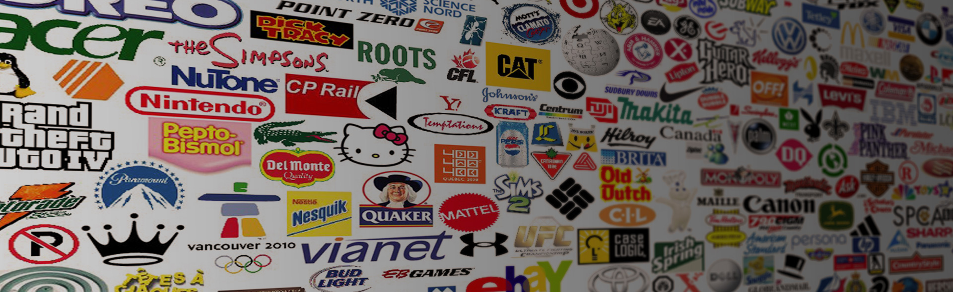
Every successful business owner will tell you that a good logo is more than just an attractive presentation of your brand. It is the picture that tells every potential customer a thousand words about your business. The key is evoking the right message and the right emotions in your desired customers. The colors in your logo can serve as powerful psychological triggers to make customers believe your services are the best choice for their business the second they lay eyes on them. The key is using the colors that evoke remedying feelings people desire when seeking out those types of services.
Here are is a breakdown of the most basic colors, what emotions they evoke, and what services they can effectively attract customers to:
Red
Emotions: Love, Anger, Aggression, Passion, Sensuality, Intensity
Red is the most used color in logos as it has such a wide range of different emotions but carries them all intensely. Red can serve to intensify or evoke the passion of whatever niche you’re in. One thing red is not is known to be is relaxing or calm. Many restaurants can get away with a lighter shade of red as they are feeding off a potential customer’s intense desire to eat that kind of food or that get immediate service. Notice how many fast food logos have red in them.

If you’re opening a therapeutic business or place of knowledgeable healing, it might be best to leave red out of your logo. You see that most doctor’s offices don’t use red in their logos but hospitals do. Hospitals get away with it because at times there is no more serious place in the world.
Orange
Emotions: Pleasure, Boldness, Distrust, Enthusiasm
The shades of orange can cover a wide variety of emotions but one that stands out among them all is boldness. Orange is not quite powerful enough to evoke the passion of red nor is it dark enough to be clam or subtle. Orange would be a good color for a business that is bold but supplies innocent services such as toys, daycares, vacations, etc.

Orange is very easy to contrast however and if coupled with colors like black or even just darker shades of blue, and purple, can carry a more serious tone.
Yellow
Emotions: Cheer, Joy, Energy, Caution, Sickness
Yellow is naturally a bright color so you will usually find it evokes more of the happy emotions than any others. However, like orange, yellow finds itself powerless to change it’s meaning even with darker shades. Even the darkest yellow can only make people think of mild sickness or decay. It’s for this reason it’s deemed a simpler, more childish color.

As such it is generally more appropriate for family friendly businesses such as water parks, family restaurants, toy, shops, etc.
Green
Emotions: Harmony, Fresh, Ambition, Greed
Green is a color commonly associated with finance, safety, and nature. Many outdoor recreation companies use green their logo to really push the raw, harmonious nature that comes with experiencing their products. Camping equipment, yard care, finance, and health food establishments could very effectively utilize green in their logos.

Blue
Emotions: Calm, Trust, Confidence, Seriousness
Blue is a color most associated with business because it evokes a sense of balance as well as calm intelligence. Like the water blue can adapt to anything and look as if it had no problem doing so. It’s for this reason that blue tends to be the color of many businesses with niches like pediatrics, physical therapy, and other serious problem solving services.

A lighter blue evokes more trustworthiness where a darker blue evokes presence of intelligence. Both are good to have but it’s important to decide which one is more likely to get the customer through the door. Think light blue=safe, dark blue=professional (waterpark vs police uniforms).
Purple
Emotions: Ambition, Dignity, Mystery, Independence
You rarely see many logos full of purple because it tends to evoke very specific emotions that we tend to feel less often than we should. Purple is not the color that will appeal to everybody but it still attracts a certain clientele that is looking to differentiate itself as unique. Businesses who deal with more vanity or high-class niches such as jewelry, luxury cars, or beauty could have some success with purple.

Brown
Emotions: Comfort, Strength, Laziness, Isolation
Possibly the most modest color of all, brown seems to limit’s logo presence to the more masculine, outdoor businesses. The most prevalent of brown’s emotions seems to be isolation as it’s just light enough to let us know it’s there but keeps to itself. Camping equipment, hunting, and other businesses that allow people to do things themselves tend to fall under the brown banner.

Black
Emotions: Power, Mysterious, Grieving, Elegance
Any logo meant to give the customer a sense of power holds a little bit of black in it. Black is the ultimate dominance and ultimate finality. The more power that the services deal in, the more black that is used in the logo. Think of athletic symbols like Under Armour and Nike sports gear relies on making the customer feel more powerful for wearing their clothes. Similarly, formal wear helps the individual feel powerful in celebration instead of performance.

White
Emotions: Innocence, Purity, Cleanliness
Not many businesses can pull off a lot white in their logos. Those who have abundance of white have to be in the business of something that is as absolute as a starting point. Bread dough, weddings, paper, things everyone at some point in their lives at least considers using.

Like black however, white is used in moderation in almost all logos. If nothing else black and white can help tell customers if your services are serious or happy.
