When music is involved with a project then I am ALL IN. Kendal Osborne, owner of The Closet Studios and I have been friends for a bit. Kendal and I met through mutual friends and since then he has been instrumental in the recording, engineering, and production of multiple music projects with my band. So, to be able to bring some creativity to someone who has helped with my own creative work was an honor.
Kendal voiced that he was wanting the logo for his studio to be something minimalistic. He showed me some examples of logos in his industry that he liked and said that he was leaning most toward a monochromatic color scheme that is black & white.
I started with a handful of ideas, brainstorming on elements that have to do with sound, recording, and sound waves. I remembered reading an article a while back about on-screen optical illusions and incorporating them into a design. That was my jumping off point with the first image below (top left). You’ll notice that when you scroll up or down the image appears to be “pulsing” similar to how a speaker would with sound coming from it. Obviously, we ended up with something different, but this started to move me in the right direction.
Above you can see the discovery process in action. I started with the top left design, then ultimately concept on the bottom right came out of it. However, as I do with most logo projects, I try not to pigeonhole myself into one “style/concept.” After the first concept, I started over with a whole other set of ideas, ran with them, and after talking things over with Kendal I then returned to the original to dig a little more.
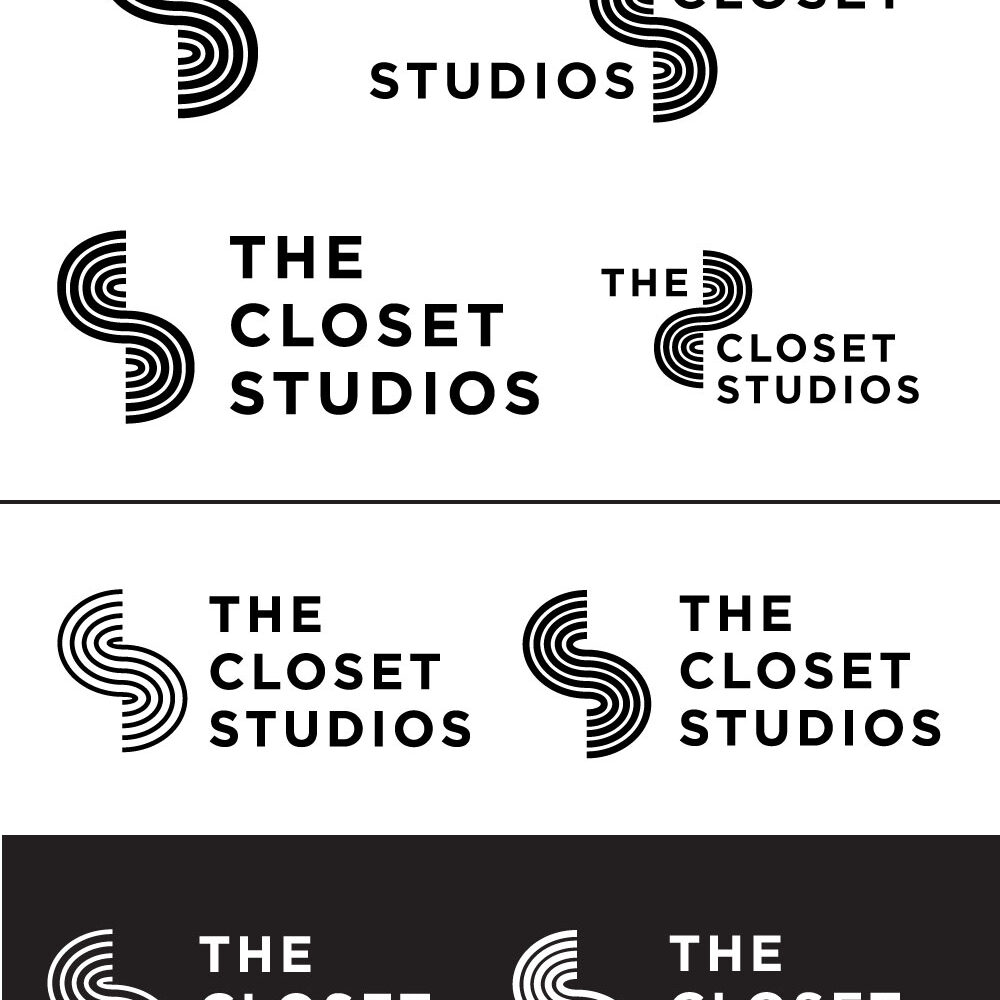
I really love what came out of this project. The end result of his logo has such an organic and natural flow to it while incorporating the initials CS (closet studios) into the image. Thanks again Kendal!
Check out his studio’s site.
I didn’t make it but if you need his services he’s the guy!


